# Number counter
The **Number Counter Section** allows you to showcase **animated statistics, milestones, or achievements**, making it ideal for **displaying company growth, customer success metrics, or key performance figures**.
{% hint style="success" %}
* **Go to** Shopify Admin > **Online Store > Themes**.
* Click **Customize** on your active theme.
* In the Theme Editor, click **Add Section > Number Counter**.
{% endhint %}
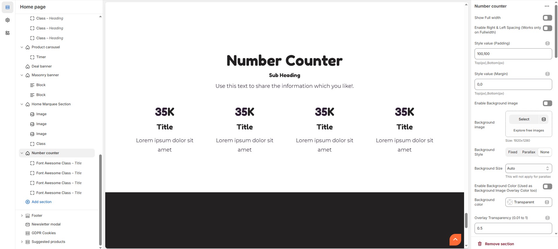
### **Number Counter Customizer Option**
* **Show Full Width:** Expands the section across the entire screen width.
* **Enable Right & Left Spacing (Works only on Fullwidth):** Adds spacing on both sides (Works only in Full Width mode).
* **Style Value (Padding ) :** Adjust the inner spacing above and below the section. Top(px), Bottom(px).
* **Style Value (Margin ) :** Adjust the outer spacing above and below the section. Top(px), Bottom(px).
* **Enable Background Image:** Allows adding a background image for the section.
* **Background Image:** Upload the image (Recommended size based on design requirements).
* **Background Style:** Choose background style **( Fixed, Parallax, or None )**.
* **Background Size:** Choose background size **( Auto, Cover, Contain, Repeat)**.
* **Enable Background Color:** Enable a background color (also used as an overlay color).
* **Background Color :** Customize the background color (Set Your Preferred Color).
* **Enable Overlay:** Adds an overlay effect to the background.
* **Overlay Transparency:** Adjust the transparency of the overlay value (between 0.01 and 1).
* **Main Heading:** Customize the Main heading.
* **Sub Heading:** Add a short text to the content.
* **Description:** Add text to share information about the section.
* **Link Text:** Customize the text for the clickable link.
* **Link URL:** Paste a URL or search for an internal link.
### **Section Color Settings**
* **Heading Color**: Customize the main heading color (Set Your Preferred Color).
* **Sub Heading Color**: Customize the sub-heading color (Set Your Preferred Color).
* **Description Color**: Customize the description text color (Set Your Preferred Color).
* **Button Background Color**: Customize the button background color (Set Your Preferred Color).
* **Button Text Color**: Customize the button text color (Set Your Preferred Color).
* **Button Hover Background Color**: Customize the hover background color of the button (Set Your Preferred Color).
* **Button Hover Text Color**: Customize the button text color on hover (Set Your Preferred Color).
* **Heading Position :** Choose heading position **( Center, Left, Right ).**
### **Block Settings**
* **Items per Row**: Choose the number of items displayed per row .
* **Column Gap**: Customize spacing between columns. (Leave empty for default border radius).
* **Counter Style :** Choose the counter style **(Grid and List).**
* **Content Position (Only for list style) :** Choose the content position (Vertical top, Vertical center, Vertical bottom).
* **Text alignment :** Choose the text alignment **(Center, Left, Right).**
### **Reverse Columns**
* **Content reverse :** Enable or disable the content reverse.
* **Enable boxed style :** Enable or disable the boxed style.
* **Enable Overall Border (Boxed Style will not work, if this is enabled) :** Enable or disable overall border.
* **Overall Radius (Units not needed) :** The border corners can be rounded using the overall border-radius property. (Leave empty for default border radius).
* **Icon Radius (in px) - Set 50% for Rounded Icon :** Customize icon corner radius.
* **Icon/Image Outer Size (Units not needed) :** Customize the size for the outer icon/image layer.
* **Icon/Image Size (Units not needed) :** Customize the inner size of icon / image note that the inner size should be small than outer icon/image layer.
* **Enable Box Shadow :** Adds a shadow effect to section.
### **Block Color settings**
* **Block BG color (Enable boxed style or Overall Border Checkbox above) :** Customize the block background color (Set Your Preferred Color).
* **Icon Border Color :** Customize the icon border color (Set Your Preferred Color).
* **Icon BG color :** Customize the icon background color (Set Your Preferred Color).
* **Icon color :** Customize the icon color (Set Your Preferred Color).
* **Heading color :** Customize the heading color (Set Your Preferred Color).
* **Description color :** Customize the description color (Set Your Preferred Color).
* **Value color :** Customize the value color (Set Your Preferred Color).
* **Value text Color (Suffixes like K, %) :** Customize the value text color (Set Your Preferred Color).
* **Overall Border Color :** Customize the overall border color (Set Your Preferred Color).
### **Advanced Customization**
* [**Custom Class:**](https://wdtsupport.gitbook.io/shopify-os/custom-class) The Shopify allows you to apply unique CSS styles to specific sections, blocks, or elements within your theme.
### **Add Block Customization Options**
### **Image**
* **Icon** : Upload the image (Recommended size based on design requirements).
* **Title** : Customize the heading.
* **Text** : Add text to share information about the section.
* **Value:** Customize the number for the value.
* **Value text :** Customize the value text.
### **Font Awesome Class**
* **Font awesome class:** Customize the [font awesome icon](https://fonts.google.com/icons).
* **Title** : Customize the heading.
* **Text** : Add text to share information about the section.
* **Value:** Customize the number for the value.
* **Value text :** Customize the value text.