# Support Block
The **Support Block** is designed to assist users in quickly accessing help and resources related to the theme.
{% hint style="success" %}
* Navigate to **Shopify Admin > Online Store > Themes**.
* **Click** Customize on your active theme.
* **In the Theme Editor**, click **Add Section > Support Block**
{% endhint %}
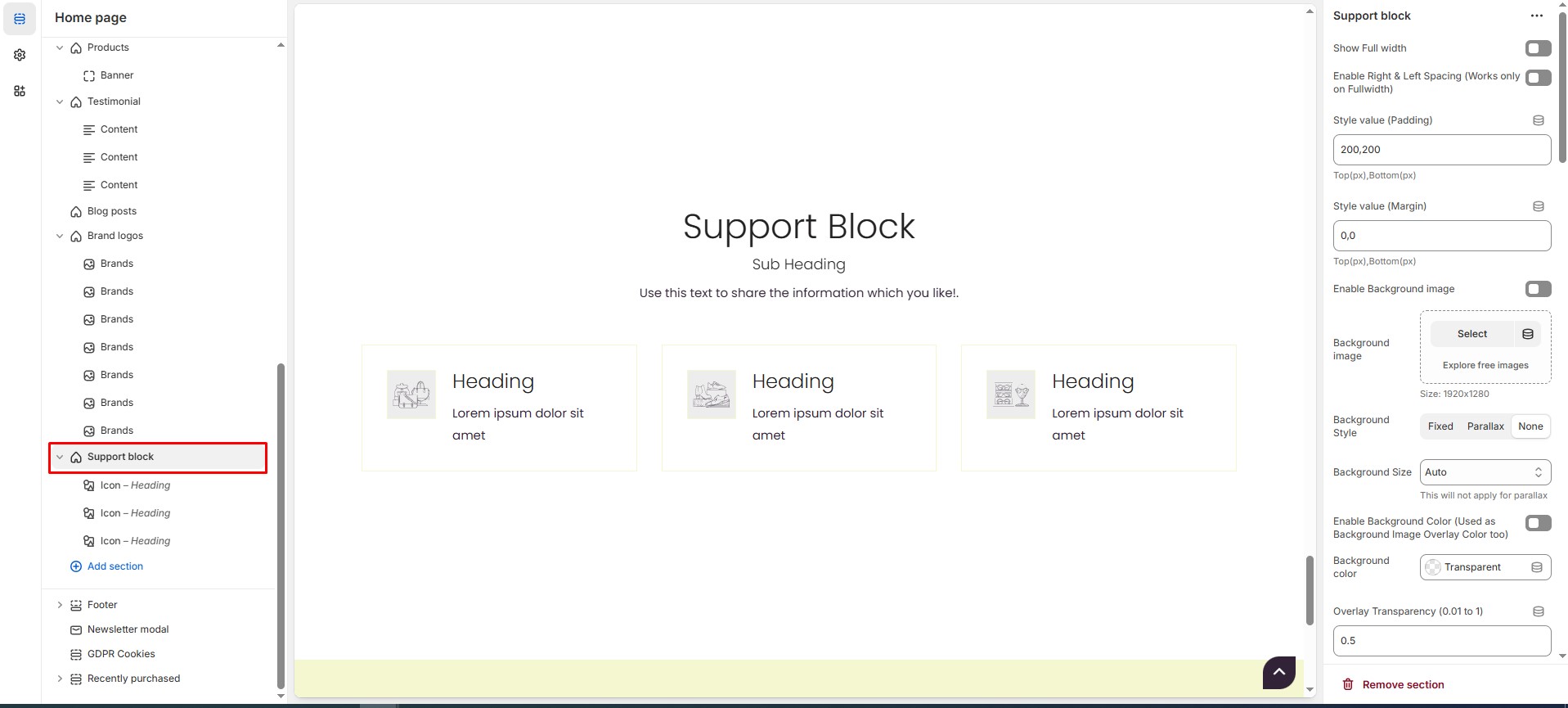
### **Support Block Settings & Customization Options**
* **Show Full Width:** Expands the section across the entire screen width.
* **Enable Right & Left Spacing(Works only on Fullwidth):** Adds spacing on both sides (Works only in Full Width mode).
* **Padding (Top, Bottom):** Adjust the inner spacing above and below the section. Top(px), Bottom(px).
* **Margin (Top, Bottom):** Adjust the outer spacing above and below the section. Top(px), Bottom(px).
* **Enable Background Image:** Allows adding a background image for the section.
* **Background Image:** Upload the image (Recommended size based on design requirements).
* **Background Style:** Choose background style **( Fixed, Parallax, or None )**.
* **Background Size:** Choose background size **( Auto, Cover, Contain, Repeat)**.
* **Enable Background Color(Used as Background Image Overlay color too):** Allow to enable the background color.
* **Background Color :** Customize the background color (Set Your Preferred Color).
* **Enable Overlay:** Adds an overlay effect to the background.
* **Overlay Transparency:** Adjust the transparency of the overlay (value between 0.01 and 1).
* **Main Heading:** Customize the Main heading.
* **Sub Heading:** Add a short text to the content.
* **Description:** Add text to share information about the section.
* **Link Text:** Customize the text for the clickable link.
* **Link URL:** Paste a URL or search for an internal link.
### **Color Settings**
* **Heading Icon Color**: Customize the heading icon color (Set Your Preferred Color).
* **Heading Color**: Customize the heading color (Set Your Preferred Color).
* **Sub Heading Color**: Customize the sub-heading color (Set Your Preferred Color).
* **Description Color**: Customize the description text color (Set Your Preferred Color).
* **Button Background Color**: Customize the button background color (Set Your Preferred Color).
* **Button Text Color**: Customize the button text color (Set Your Preferred Color).
* **Button Hover Background Color**: Customize the hover background color of the button (Set Your Preferred Color).
* **Button Hover Text Color**: Customize the button text color on hover (Set Your Preferred Color).
* **Heading Position :** Choose Heading Position alignment (**Left, Center, Right**).
### **Block Settings**
* **Block Text Position**: Choose text Position(**Left, Center, Right).**
* **Block Style**: Modify the design if multiple styles are available. Choose the block style **(Style1, Style 2, Style 3).**
* **Items per Row**: Choose the number of items displayed per row .
* **Enable Grid Style**: Enable or disable the Grid style.
* **Vertical Position**: Choose the vertical position **(Vertical top, Vertical center or Vertical bottom).**
* **Content Reverse**: Swap the order of content and image
* **Overall Radius**: The border corners can be rounded using the overall border-radius property. (Leave empty for default border radius).
* **Icon Radius**: The border corners can be rounded using the icon border-radius property. (Leave empty for default border radius).
* **Enable Box Shadow**: Adds a shadow effect to section.
* **Icon/Image Outer Size**: Customize the size for the outer icon/image layer.
* **Icon/Image Size**: Customize the inner size of icon / image note that the inner size should be small than outer icon/image layer.
### **Block Color Settings**
* **Border Color**: Customize the border color (Set Your Preferred Color).
* **Background Color**: Customize the background color (Set Your Preferred Color).
* **Icon Background Color**: Customize the icon background color (Set Your Preferred Color).
* **Icon Border Color**: Customize the border color of icons (Set Your Preferred Color).
* **Heading Color**: Customize the heading color (Set Your Preferred Color).
* **Description Color**: Customize the description text color (Set Your Preferred Color).
* **Button Background Color**: Customize the button background color (Set Your Preferred Color).
* **Button Text Color**: Customize the button text color (Set Your Preferred Color).
* **Button Hover Background Color**: Customize the hover background color (Set Your Preferred Color).
* **Button Hover Text Color**: Customize the hover text color (Set Your Preferred Color).
### **Advanced Customization**
* [**Custom Class:**](https://wdtsupport.gitbook.io/shopify-os/custom-class) The Shopify allows you to apply unique CSS styles to specific sections, blocks, or elements within your theme.
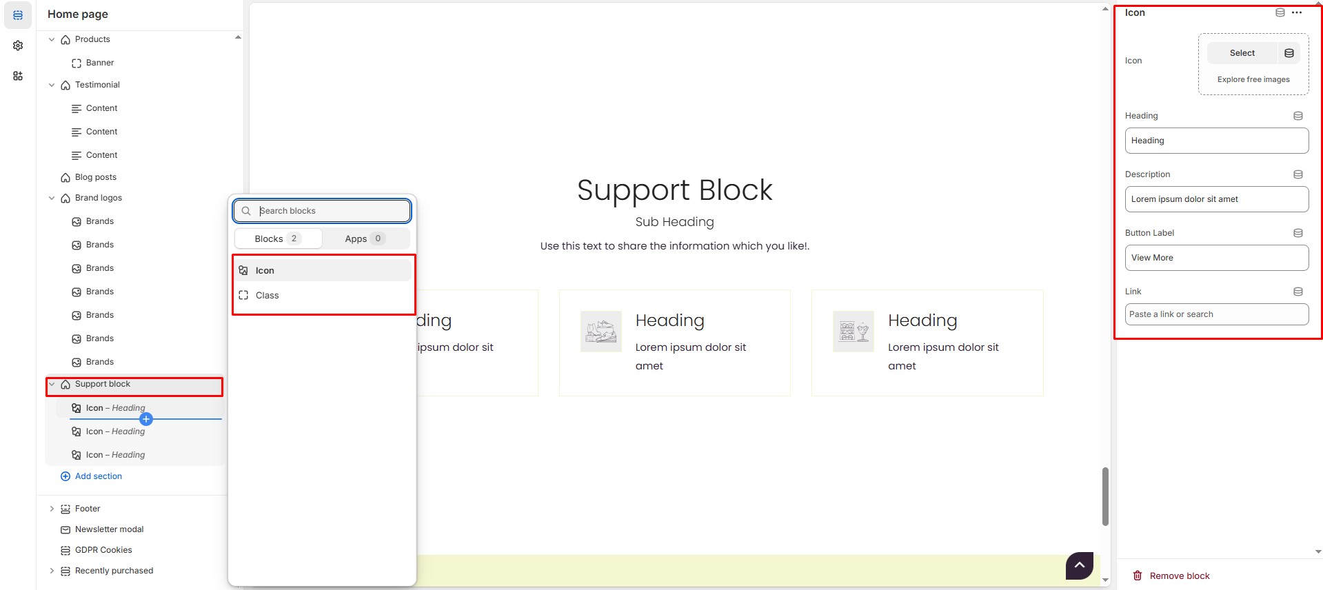
### **Add Block Customization Options**
**Icon**
* **Icon** : Upload the image (Recommended size based on design requirements).
* **Heading**: Customize the heading.
* **Description**: Add text to share information about the section.
* **Button label:** Customize the text for the clickable link.
* **Link :** Paste a URL or search for an internal link.
**Class**
* **Class** : Add the font awesome icon (Eg., fa fa-instagram).
* **Heading**: Customize the heading.
* **Description**: Add text to share information about the section.
* **Button label:** Customize the text for the clickable link.
* **Link :** Paste a URL or search for an internal link.