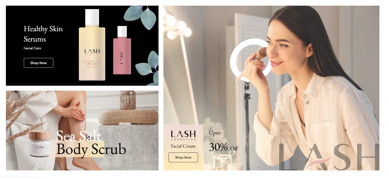
# Masonry Banner
The **Masonry Banner** section allows you to display multiple banners in a structured grid layout, enhancing the visual appeal of your store. This section is ideal for showcasing promotions, featured collections, or seasonal campaigns.
{% hint style="success" %}
* **Go to** Shopify Admin > **Online Store > Themes**.
* Click **Customize** on your active theme.
* In the Theme Editor, click **Add Section > Masonry Banner**.
{% endhint %}
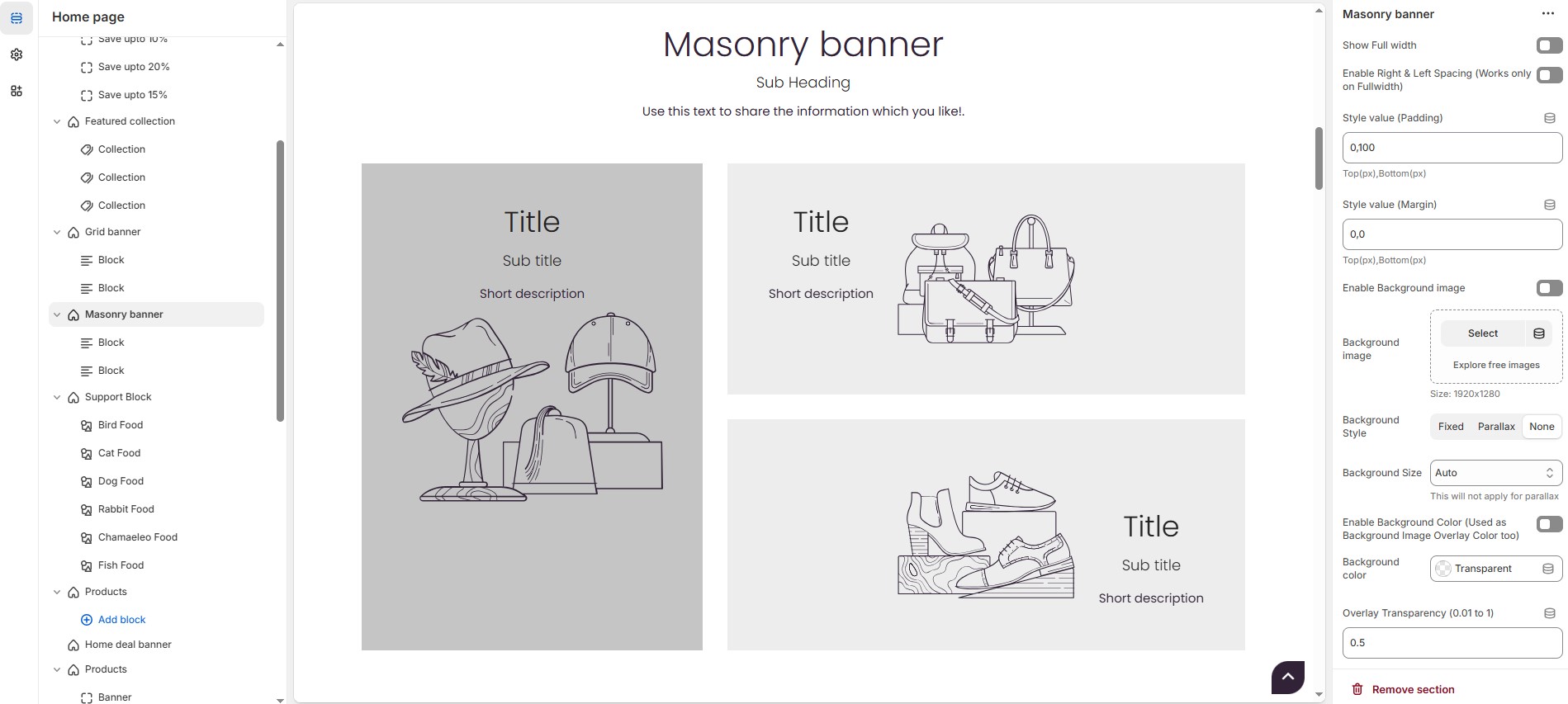
### Masonry Banner **& Customization Options**
* **Show Full Width:** Expands the section across the entire screen width.
* **Enable Right & Left Spacing (Works only on Fullwidth):** Adds spacing on both sides (works only in Full Width mode).
* **Style Value (Padding ) :** Adjust the inner spacing above and below the section. Top(px), Bottom(px).
* **Style Value (Margin ) :** Adjust the outer spacing above and below the section. Top(px), Bottom(px).
* **Enable Background Image:** Allows adding a background image for the section.
* **Background Image** : Upload the image (Recommended size based on design requirements).
* **Background Style:** Choose background style **( Fixed, Parallax, or None )**.
* **Background Size:** Choose background size **( Auto, Cover, Contain, Repeat)**. This will not apply for parallax.
* **Enable Background Color:** Enable a background color (used as background image overlay color too).
* **Overlay Transparency:** Adjust the transparency of the overlay (value between 0.01 and 1).
* **Main Heading:** Customize the Main heading.
* **Sub Heading:** Add a short text to the content.
* **Description:** Add text to share information about the collection.
* **Link Text:** Customize the text for the clickable link.
* **Link URL:** Paste a URL or search for an internal link.
* **Heading position** : Choose heading position**( Left, Right, Center )**.
### **Section Color Settings**
* **Heading Color:** Customize the heading color (Set Your Preferred Color).
* **Sub Heading Color:** Customize the sub-heading color (Set Your Preferred Color).
* **Description Color:** Customize the description text color (Set Your Preferred Color).
* **Button Background Color:** Customize the button background color (Set Your Preferred Color).
* **Button Text Color:** Customize the button text color (Set Your Preferred Color).
* **Button Hover Background Color:** Customize the hover background color for buttons (Set Your Preferred Color).
* **Button Hover Text Color:** Customize the hover text color for buttons (Set Your Preferred Color).
### **Display Settings**
* **Main Banner Style** : Choose between **Grid** or **Overlay** styles.
* **Additional Banners Style** : Choose between **Grid** or **Overlay** styles.
* **Column reverse :** Enable to swap the column order.
* **Column Gap:** Customizer spacing between columns (Leave empty for default gap in px).
* **Enable Box shadow :** Adds a shadow effect to the banner.
* **Banner Border Radius :** The border corners can be rounded using the collection border-radius property. (Leave empty for default border radius).
### **Content Width Settings**
* **Content width - Desktop :** Defines how content and image are split (Eg., 65 / 35).
* **Content width - Laptop :** Defines the layout for smaller screens (Eg., 40/ 60). Mobile resolution defaults to 100/100.
### **Main Block Settings**
* **Main Banner Text Alignment** : Choose banner text alignment ( **Left, Center, or Right)**.
* **Main Banner Content Position** : Choose banner content position **(Top left, Top center, Top right, Center left, Center, Center right, Bottom left, Bottom center, Bottom right).**
* **Image :** Upload the image (Recommended size based on design requirements*)*.
* **Title:** Customize the Title.
* **Sub Title :** Add a short text to the content.
* **Description :** Add text to share information about the collection.
* **Link Text:** Customize the text for the clickable link.
* **Link URL:** Paste a URL or search for an internal link.
### **Main Block Color Settings**
* **Banner BG:** Customize the banner background color (Set Your Preferred Color).
* **Heading color:** Customize the heading color (Set Your Preferred Color).
* **Sub heading color:** Customize the sub heading color (Set Your Preferred Color).
* **Description color:** Customize the Description color (Set Your Preferred Color).
* **Button bg color:** Customize the Button background color (Set Your Preferred Color).
* **Button text color:** Customize the Button text color (Set Your Preferred Color).
* **Button hover bg color:** Customize the Button hover background color (Set Your Preferred Color).
* **Button hover text color:** Customize the Button hover text color (Set Your Preferred Color).
### **Main Banner Overlay Settings**
* **Overlay style :** Choose overlay style **(** **Normal Overlay** or **Gradient Overlay )**.
* **Overlay color :** Customize the Overlay color (Set Your Preferred Color).
* **Overlay opacity** : Adjust the transparency of the overlay (value between 0.01 and 1).
* **Gradient Position (0 to 360) :** Customizer the gradient position.
### **Additional Block Settings**
* **Additional Banner Block Style** : Modify the multiple styles that available as dropdrown in Additional banner block style.
### **Overlay Style Height**
* **Overlay Style Height :** Customize the minimium height based on device.**(Height works for Additional Banners, So, Main Banner height depends on additional banners height).**
{% hint style="success" %}
**Recommended Minimum Heights:** Desktop – 600px | Laptop – 550px | Tablet – 500px | Mobile – 450px **(You can set the responsive size as per your needs.)**
{% endhint %}
### **Advanced Customization**
* [**Custom Class:**](https://wdtsupport.gitbook.io/shopify-os/custom-class) The Shopify allows you to apply unique CSS styles to specific sections, blocks, or elements within your theme.
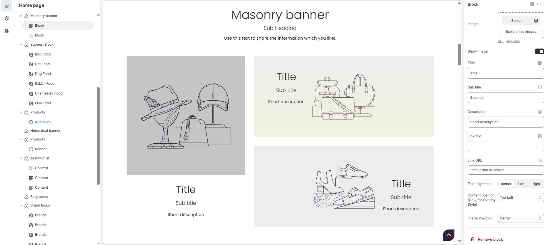
### **Customization Options for Blocks**
* **Image** : Upload the image (Recommended size based on design requirements).
* **Show Image** : Enable/disable the display of the image.
* **Title** : Customize the Title.
* **Sub title** : Add a short text to the content.
* **Description** : Add text to share information about the collection.
* **Link Text:** Customize the text for the clickable link.
* **Link URL:** Paste a URL or search for an internal link.
* **Text Alignment** : Choose text alignment **(Left, Right, Center)**.
* **Content Position** : Choose the position **(Top left, Top center, Top right, Center left, Center, Center right, Bottom left, Bottom center, Bottom right).**
* **Image position :** Choose the position **(Top left, Top center, Top right, Center left, Center, Center right, Bottom left, Bottom center, Bottom right).**
* **Content reverse** : Swap the order of content and image (Only for Grid Style).
### **Block Color Settings**
* **Icon Background Color (Only for Block Style 1):** Allows to customize the icon background color (Set Your Preferred Color).
* **Icon Color:**Allows to customize the icon color Set Your Preferred Color).
* **Banner Bg** : Customize the banner background color (Set Your Preferred Color).
* **Heading Color** : Customize the heading color (Set Your Preferred Color).
* **Subheading Color** : Customize the sub heading color (Set Your Preferred Color).
* **Description Color** : Customize the description color (Set Your Preferred Color).
* **Button Background Color** : Customize the button background color (Set Your Preferred Color).
* **Button Text Color** : Customize the button text color (Set Your Preferred Color).
* **Button Hover Background Color** : Customize the button hover background color (Set Your Preferred Color).
* **Button Hover Text Color** : Customize the button hover text color (Set Your Preferred Color).
* **Heading Color (Only for Layout Style 3)**: Customize the heading color (Set Your Preferred Color).
* **Subheading Color(Only for Layout Style 3)**: Customize the sub heading color (Set Your Preferred Color).
* **Description Color(Only for Layout Style 3)**: Customize the description color (Set Your Preferred Color).
### **Overlay Settings**
* **Overlay style :** Choose overlay style **(** **Normal Overlay** or **Gradient Overlay )**.
* **Overlay color :** Customize the Overlay color (Set Your Preferred Color).
* **Overlay opacity** : Adjust the transparency of the overlay (value between 0.01 and 1).
* **Gradient Position (0 to 360) :** Customizer the gradient position.Only for gradient overlay.